Thursday 19 December 2013

EVALUATION


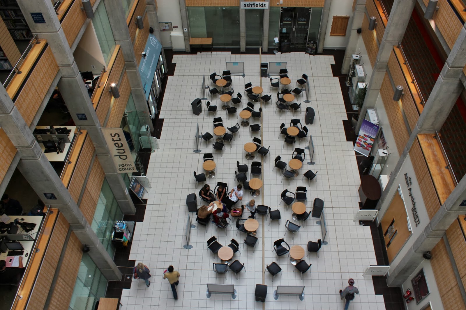
I feel that I followed my own brief very well as my main aim was to have a street photography style, concentrating on the mystery of the image- What is happening and why? I chose a theme of mystery because I thought it would allow me to be creative with what I found on the streets and I feel I was successful at this as I have a good range of images. Each of them having different possibilities of stories/mystery behind them.

I didn’t specify in my brief the type of images I was looking for; I just left my planning to chance, because you can’t plan what people will naturally be doing on the streets, you just have to take the photo as it happens. For example, like my image of the fishing rod and fish - I didn’t plan for the man to catch a fish and I didn’t know he was going to, but luckily for me he had caught one whilst I was stood behind him, and not knowing what setting my shutter speed, aperture and ISO were on, I quickly aimed the camera at the fish and hoped for the best. I didn’t know the image was going to include the fishing rod in the centre of the image and have the fish blurred out in the background, I also didn’t know I was going to be zoomed in on 55mm, but in my opinion I think the image works well like that and it is one of my favourite images from the project. Planning my images would have been too restrictive and wouldn’t have allowed me to capture images of what really happens around us.

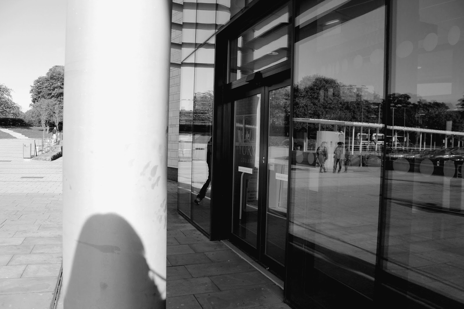
The strengths in my final images is that they all include a range of compositional techniques such as; rule of thirds, depth of field, reflections, shadows, leading lines and framing. I feel all these techniques made my images look more eye catching and interesting to look at. I edited all my final images on Photoshop and I feel this made them look even stronger. For 3 of my images, I made them black and white as this makes them look less distracting, but also makes them look more stimulating because they look simple. It also makes us focus more on what is happening in the image, rather than concentrating on the colours.

For one of my black and white images, I edited it slightly different so that the lady waiting at the bus stop would still be in colour as she was wearing a long red coat and shoes and by leaving her in colour I feel made the image look more striking and appealing to look at.

In my brief I said that I would edit all the images to be black and white, however not all of them are because when I was writing my brief I didn’t know what images I was going to take and depending what is happening in the image depends how you edit it. It was a nice sunny day when I was out taking my photographs so I wanted to enhance this in my final images by working with the levels and saturation to make them look warm and autumn looking therefore pleasing to look at.

For improvements, I need to try and take images in more than once concept of view. For example, my image of the rope leading us to the boat, the main focus is in the centre of the image and the foreground of the rope and leaves and the background of the boat are blurry. Here isn’t much to look at in the centre of the image, so if I was to take the image again, I would change my aperture so that the focus was in the foreground, focusing on the detail of the leaves and the texture of the rope, still leaving the boat out of focus for the mystery effect. I would also take it with the rope in the left third of the image rather than dead centre, so it would allow us to see more of the boat in the background.

I feel my project as a whole went very successful as in my brief I stated that I want people to have their own opinion of the mystery of the photos and what it happening and I feel this is achievable with the images I’ve produced. For example, my image of the Fisher man by the river with his hand by his face - some people might say he’s waving, however other people might think he’s blocking the sun out of his eyes. And for my image of two people on the bridge looking at the Ipad – some people might think they’ve just taken a picture with it and are now looking at it and some people might think that they’re looking at Google maps because they’re lost and don’t know where they are.

Thursday 21 November 2013

Production

In this blog I am going to talk about how I will produce my images. In my brief I said that I will focus on the mystery of they image-what is happening and why?

Depending on the shooting conditions, I will most likely use shutter priority, so I can adjust the shutter speed to get varied photos. Some people might be walking quite fast, so I will need a high shutter speed to capture them without the image blurring. However because my theme is mystery, I could also use a slow shutter speed to make the person look blurry. Using shutter priority automatically sets the aperture and ISO. If I wanted to set them myself to make the image look how I want it to, then I will use manual mode-allowing me to use a range of different settings to get different effects. 

How I will present my pictures will depend on how many I choose for my final project. However, I think I will present them in a Gallery form in another Blog post so you can clearly see all the images and can compare them to each other.

Monday 18 November 2013

My Brief

What is Photojournalism? - Brief


My aim is to take a series of images based around mystery and what the story behind the image could be. I chose to do mystery as it allows me to be creative with what I can find on the streets because everywhere you look someone will be doing something, but what exactly? The majority of street photography style images will include people in them and it’s not always clear who they are or what they’re doing, so this then leads to a mystery behind the image. The majority of photo-journalistic photos will show a story or meaning behind them, even if they weren't intended when the image was first taken. When different people see an image, they will all have their own ideas of what is happening and who that person is. This is one of my main outcomes for my brief - for people to have different ideas about the mystery behind image.

Mystery gives me a wide opportunity of photographs to take and I can express my opinions of everyday life. When taking the images I will try and use compositional and framing techniques such as leading lines, rule of thirds and reflection to make the images look more interesting and appealing to look at. I will then turn the images into monochrome (black and white) in later production to make them stand out better and give them a simple mood as the images will be described in different shades of one colour. Also the majority of photojournalists take their photos in monochrome.

An artist who has influenced me in this theme is American photographer Diane Arbus because when she was out taking photos, she focused mainly on what people were doing in their everyday life. Like most photojournalists she wouldn't ask people to pose, she just walked the streets and took images of people she thought looked interesting. Another artist who has influenced me is Australian photographer Trent Parke. His images tend to include just one person, whether they're just stood on the street corner or crossing the road, this shows mystery because we ask why they are alone, what they're doing or where they're going.  


Wednesday 13 November 2013

Concept - ideas

My Ideas-Street Photography

1.  Mystery- Most photo journalistic photos will have a story or meaning behind them, even if they weren't intended when the photo was first taken. However, different people will have their own opinion on a photo and will have different ideas about the story behind the image. When you see a photo you immediately ask yourself, 'What is it? What's happening? Who are they?' etc. I've decided to choose mystery as one of my possible themes as it gives me a wide opportunity of photographs to be taken and I can express my opinions of a story. An artist that can influence me in this theme is Diane Arbus as she focused mainly o people and what they were doing, she didn't ask them to pose, she just took images of them doing their everyday thing.

2. Themes- Some photojournalists give themselves a theme when photographing so that they're not just taking pictures of anything random. For example themes could be; Nature, old people/young people, adventure or loneliness.  Once they have a theme, they can then expand upon it (think out of the box) and take images that they think show that theme. Also, when using a theme you can also think about compositions and framing techniques to make the image look more interesting. For example; rule of thirds, reflections and symmetry. An artist that can influence me in this idea is Sebastiao Salgado as he always gave himself a theme when taking pictures including; hard manual labour, other Americans and Genesis.

3. Places- I could give myself a certain place to take my photographs or take photo's related to a certain place. I could then expand upon this and take photos all around this place instead of just one area of it. For example, around a park or beach. Again, I would need to incorporate  different compositional and framing techniques to make the images look more interesting. To take it to the next step, I could also include a subject within that place, such as people or animals. An artist that can influence me in this idea would be Henri Cartier-Bresson as we focused of showing people in different places (such as the children playing at the Berlin Wall and Children spiraling up some staircases). He also used the geometry of the buildings to make the images look more interesting.         


I have decided to choose mystery as my final idea because it allows me to be creative with what I can find on the streets. Everywhere you look someone will be doing something, but what exactly?  And if I take a creative image that has a clear mystery story behind it, then people will start to give their opinions on what they think is happening in the image. Another Artist who has influenced me is Trent Parke because most of his images tend to include one person, whether they're just stood on the corner or crossing the road, this shows mystery because we ask why they are alone, what they're doing or where they're going.                                             

Monday 11 November 2013

What is Photojournalism?

We've been set a task to create our own brief to take a selection of images which could be used in the College's prospectus to show people what photojournalism is. 

To help me create ideas, I made a montage of different photo-journalistic photos to give me a overview of what my images should look like. From this and the previous tasks we have done I could see hat he majority of the photos are taken on he streets and aren't planned - they're just taken and people aren't asked to pose.  
Here is my Montage:


Then I had to start thinking about what images I could take to show photojournalism. To do his, I created some mind maps to help me plan out my ideas where I could talk about the different themes within photojournalism. Here is my first mind map: 


As you can see there can be many different themes within photojournalism, but most of the time, they are unplanned photos on real life events. If there are people in the photo, they haven't been asked to pose, therefore, this can go under street photography because you are taking unexpected photos of people. I then did a mind map on street photography:

As you can see, when doing street photography you can give yourself a certain theme/subject to photograph so you're not just taking photos of something someone random on the street. 

Photojournalism is also about them mystery and story of the photo, what's happening and why? Who is in the image and why are they there? etc.

Wednesday 23 October 2013

Robert Frank and Achievement


We looked at some of the images in Robert Frank's photo book called 'The Americans'. Robert Frank is a Swiss photographer who moved to America after the second world war because of the threat of Nazism affecting his understanding of oppression.
On the front cover we can see one of the most famous images which shows the segregation between white and black people on a bus, this was a big issue in 1950's America. Frank, like many Photographer didnt ask the people on the bus to pose, he simply took the picture as the bus drove past and this allowed us to see what life was really like in 50's America.

We were given the task to go around college and take images of what we thought showed achievement.This was quite a difficult task so I had to be very imaginative and creative. Here are some of my images:


My first image clearly shows achievement as we see a football trophy which the college had won during a womens tournament, you can also see a picture of the team behind it. I used a low aperture when taking this image because I wanted the background to be out of focus because the trophy is the main subject within the image, so therefore by making it the only thing in focus it would stand out more. 
 My next photo is more a 'out of the box' and humorous approach to show achievement. I saw this sign and all the bikes lined up next to it and I suddenly thought "achievement of dismounting their cycles". Again I used a low aperture to mainly focus on the sign leaving the bikes out of focus, however, we can still see that they're bikes.
 Now you might be thinking how does a ladybird show achievement? Well if you think about it in more depth, look at the amount of spots it has. The more spots a ladybird has, the older it is and this here lady bird has lots of spots, therefore showing us it's quite old. So technically you could class this as achievement, living a long life in ladybird years because I don't think anymore spots will fit on this ladybirds back!
For my final image again you have to be more imaginative as to how it shows achievement. Well, I think this berry shows achievement as its the last berry left hanging! All the other berries have fallen off and were left to rot or get eaten by some hungry bird, but this wee berry is still fighting strong! This image also shows my personal achievement as I managed to capture the water droplet hanging off the berry before it dripped off! :-) yaay go me!!

Monday 21 October 2013

Lee Friedlander Interpretations

Lee Friedlander (born July 14, 1934) is an American photographer and artist. In the 1960s and 70s, working primarily with 35mm cameras and black and white film, Friedlander evolved an influential and often imitated visual language of urban "social landscape," with many of his photographs including fragments of store-front reflections, structures framed by fences, posters and street signs.

He tried to include himself within his images somehow and most the time he did this by including shadows or reflections of himself. Like this image for example, we can see his shadow on the back of the woman in front of him: 


Here are some if my interpretations trying to use some of his techniques:

 In this image I have used reflection, but also repetition because I am reflected twice in the two mirrors. I made it so the smiley face on the Gum dispenser covers my face to give the image more of a humorous feel. Like in Friedlander's images, you can see his reflection, but not all of him and not very clearly - this is what i have interpretated in my image. 
 In this image, of another gum dispenser  I am again incorporated in the image by a reflection  but this time, it is only my hand, arm and the camera you can see as I wanted to get the sign "feed me gum" within the image as well.
For this image, you can see a shadow of me on the pole, but I have also incorporated the reflection of people outside in the glass door. This uses two of the techniques with Friedlander used.
 This image is slightly blury this is because it is all a reflection from one of the mirrored windows outside college. As you can see i am again in the image by reflection, however you can't see my face, and this gives the image a question of identity, like Friedlander's did when they just included his shadow. 
Finally in this image we can only see a reflection of the railing in the glasss pane, but it still looks effective.

SebastiĆ£o Salgado


SebastiĆ£o Salgado (born February 8, 1944) is a Brazilian social documentary photographer and photojournalistSalgado works on long term, self-assigned projects many of which have been published as books: The Other AmericasSahelWorkersMigrations and Genesis. The later three are mammoth collections with hundreds of images each from all around the world. His most famous pictures are of a gold mine in Brazil called Serra Pelada. Here are some of his images:

Here we can see one of the many images Salgado took at the Serra Pelada gold mine. This image is very powerful as you can see there are hundreds of men, climbing very steep ladders with heavy sacks on their backs.The amount of people cramped on the ladders just shows us the sheer amount of hard work these men are doing and they don't look in the best of conditions. They are wearing old rags for clothes and not very sturdy shoes, and this makes us feel more sympathy for the hard workers who are also covered in mud.

In this image we can see two men working with and oil rig. Again, the men are covered in oil and mud and don't look very happy about it. Salgado didn't ask them to pose for the photo he just took it as they were working as this gives us a clearer understanding of the work these men are doing.


Here we can see people outside their tents and again they are in shabby clothing and look like they've had a hard day or work. None of the people in this image are posing, Salgado just took it as he was walking through.


There's is a recurring theme in most of Salgado's images, they include a lot of  manual labour to show the hard work people go through each day.

Wednesday 16 October 2013

Image Interpretations 2 (Diane Arbus)

In lesson we looked at several different photo's by artists Henri Cartier-Bresson, Diane Arbus, David Seymour and Louis Faurer. We then annotated them with what techniques we saw, such as symmetry, leading lines and rule of thirds, but we also discussed what the story could be within the image or about the people in it. In some of these images, people were looking in the lens of the camera as they were taken so suddenly. We then had to go around college and again take pictures of people, but try and include and story within the image. 


 The straight lines on the carpet and railing leads us into the woman cleaning the glass.She isn't looking into the camera lens as she is watching what she is doing. However, we can see that she has quite a miserable facial expression. Maybe she is sick of cleaning the same places around college each day. Maybe she's stuck with this job because there are no other jobs out there for her. 
 For this image, we can see a young man looking into the camera, this is because he suddenly looked up just as i was taking the image. Although he's looking into the camera, the image is still effective as he isn't pulling a face or posing. The image is also slightly blurred, this is because I took the picture so quickly that the camera didn't really focus.


                                                       This image again shows people about their everyday business. I was lucky to spot these two looking over the balcony so I quickly took a picture of them before they moved. The story behind the image is what are they looking at? I also positioned them in the centre third of the image because our eyes naturally look to the centre of an image if there isn't anything to lead us anywhere. 

Image Interpretation (Henri Cartier-Bresson)

After looking at some of Henri Cartier-Bresson's street photography, we could see that he took images of everyday life and didn't ask people to pose for his images, he just took them. Taking this and his compositional techniques into account, I went around college to take some 'sneaky' photos of people. As you'll see, I also took them in Black and White because that's the colour most of Henri's images were when using his 'old film' camera.


 Here, you can see the leading line of the bookshelf which draws us into the centre of the image, where you will see more books. The main subject is of Callum flicking through the pages of the book. I positioned the camera so that the book was in the centre third, Callum in the right third and the book shelf in the left third. 

Again I used leading lines to draw people into the image. I positioned the railing  in the centre of the image to lead us to the people looking over the balcony. The two people aren't looking into the lens of the camera which makes the image more effective because Henri took images of what was happening around him and didn't get anyone to pose for his pictures. 


 In this image you can see I took it in the middle of two people having a convosation whilst buttering their scones. Again, this captures the natural life of people that Henri used to capture.


For this image I placed the man on his iPad in the left third of the image to make it look more intersting. Henri too would place his subjects in different thirds of the image. 

Monday 14 October 2013

Image Analysis

Henri Cartier-Bresson-Image Analysis

Henri Cartier-Bresson (August 22, 1908 – August 3, 2004) was a French photographer considered to be the father of modern photojournalism. He is known for his black and white street photography where he uses compositional techniques and geometry to tell the story of his images.


In this image, Henri has used the effects of silhouettes to draw us into the image. The silhouettes clearly stand out to our eyes because there in no detail on them, so initially we're just looking at a black shape. You could also say that Henri is using 'rule of thirds' in this image because in each third, there is something to focus on. The main thing we focus on is the man the doing the leap in the air, this is because he is in the centre of the image and closest to us. We then look at the couple in the right third of the image as they are a little further back but because the silhouette is a bold black, they stand out. Finally, we look at the Eiffel Tower and the left third of the image, this is because the silhouette is not as bold as the people and it is also the furthest away from us. 


In this image of the Berlin Wall, Henri again uses the 'rule of thirds' but also leading lines. The length of the wall makes us want to follow it into the background to see where it will lead is. This is why this technique is called leading lines because the lines leads us into something and in this case, leads us to the never ending wall. The image also follows the rule of thirds with the foreground in the left third showing us the children playing. The innocence and loneliness of the children playing also draws us into the image as we feel sympathy for them as they're not sure why the wall is there, so they incorporate the wall into their play by attempting to climb it so that they can escape. In the middle of the image we see the lonely child and in the right third we see the never ending wall with barbed wire, leading us into the un-known. 


Again in this image, Henri uses leading lines to draw us into the image. Here he uses the 'Fibonacci spiral' as the line to lead us into the centre of the image and to convey a sense of depth. It seems the main subjects are the children, but it is actually the geometry of the spiral going upwards, the children just act as an aid. Our eyes naturally follow leading lines within an image and in this case, we ignore the children as the get further away and just focus on the strong geometry shape which also acts as an illusion giving the image more depth.

Wednesday 9 October 2013

Picture Styles, White balance and RAW vs JPEG

 Picture Styles

Picture styles are already set on the camera and you can use them to change the appearance of a JPEG image. For example you can take an image in black and white straight on the camera rather than having to change it later in post processing software like Photoshop. Advantages of using picture styles are they can be uploaded quickly and you can also preview each picture style before you take the image. Disadvantages are that the camera chooses which tones to set the black and white to and this can sometimes not make the final image look as good as if it were to be edited in post processing. Also in post processing you can change the effects to exactly how you want them, however, on the camera, there are custom picture style settings but you cant change the settings on that image once the picture has been taken. Here are some of my images using different picture styles on the camera;


 This picture I took on the Monochrome picture style setting. Black and white images are not usually starkly contrasted as black and white. They combine black and white together producing a range of shades of grey. 


For this image I used the Saturated picture style and I was able to adjust how high or low I wanted the saturation to be on the camera. I set it as high as it would go so all the colours would be very vibrant, almost giving the image a cartoon effect, however it still looking realistic.


For this image I used the custom picture style setting and I was able to adjust he saturation, colour tone and contrast myself. I set it to quite a high contrast so that the light areas in the picture would be bright. As you can see the sky is a very bright blue and fades into white on he right hand side of he image.


Colour Temperature

White balance (WB) changes the colour temperature of the image, you can make the image look cold, warm or natural depending which setting you have it on. WB/colour temperature  is measured in Kelvin (K), for example daylight WB is around 5200K and tungsten (indoor light) is around 3200K. If you set the WB to lower than it should be depending what colour temperature you're in,  then the colours in the image won't come out correctly as the whites won't come out white. However, using different setting can sometimes make an image look more appealing, for example if you wanted to give an image a warm feeling for effect. Here are three of my images that show different colour temperature: 


For this image I set the white balance to 'cloudy' so that it would have a hint of blue giving it a cold effect.


For the next image I wanted it to look quite warm, so i set the white balance to 'tungsten', giving the image those warm yellow colours.
 
 
For the final image I wanted it to have a natural colour temperature so I used the 'daylight' white balance setting because the environment I was shooting in had a bright natural light source.


RAW vs JPEG

A RAW image is an untouched and uncompressed file. It contains all the information recorded when the image is taken and allows for changes such as picture style and white balance in later production.

A JPEG image is standard format and has a compressed file which saves space but however lacks quality. Also every time you save the file, it loses quality.

For example if you took a black and white image using JPEG you wouldn't be able to change the white balance or picture style. But if you took an image using RAW you would be able to change the white balance, picture style, exposure etc in later production.

However, RAW files are not readily viewable when uploaded onto the computer, they can only be used by certain software as they require a codac (a package that reads all the information of the file and displays the image as it is). Software such as Adobe Photoshop or Bridge are need to view and edit the RAW images. Here is my example of how you can edit a RAW image:


Here is the original RAW image and as you can see it is a little over exposed and has quite a cold look to it.


Using Photoshop I was able to adjust the look of the image my self. I used scales to increase or decrease effects such as white balance, exposure, contrast and saturation.

Monday 30 September 2013

Composistion and Framing

Using Manual mode, we experimented different framing techniques we could use to create more interesting images.Here are four techniques I used:

Leading Lines
Here the line of the bus shelter roof and the straight line of trees next to it  draw you into the centre of the image. This technique is called 'leading lines' as you want to follow the lines in the image to see where they lead you.


Rule of thirds (portrait)
This portrait image of Callum uses the 'rules of thirds', as he and the tree are over to the left of the portrait. For this technique, you can set a 3x3 grid to come up on the camera screen and by placing the main object on one of the thirds (usually the left or right) it makes it look more interesting than it would be if the main subject was in the centre.

You can also place subjects on the intersection points (shown by he red circles on the grid below). For example, if you were taking a head shot, you would place an eye on one of the top corner intersecting points to make the image look more interesting. 


Symmertrical
Here we can kind of see that if you were to split the image in half, each half would be the same. For this image, it's the tables and chairs and walls of the college that would make the image look symmetrical. You can also do identically symmetrical images.


Framing
This gives the subject more interest by using depth. Here we can see Callum in the distance, but in front of him, we can see out of focused leaves and branches. This adds depth to the image and makes the viewer feel like they are in the image because they get the illusion that they are stood right behind the leaves and branches.


Here are some of the images Callum took of me using some of the above techniques;